
Handwritten Logo
Artur was working on rebranding his written logo and had asked me to write something. The idea was to have a casual, handwritten style that nods as his conceptualization process, but also somehow still holds the characters of rabbits. This is what we came up in the end -- little arches that trail the end of each word that visualize the hops of bunnies.

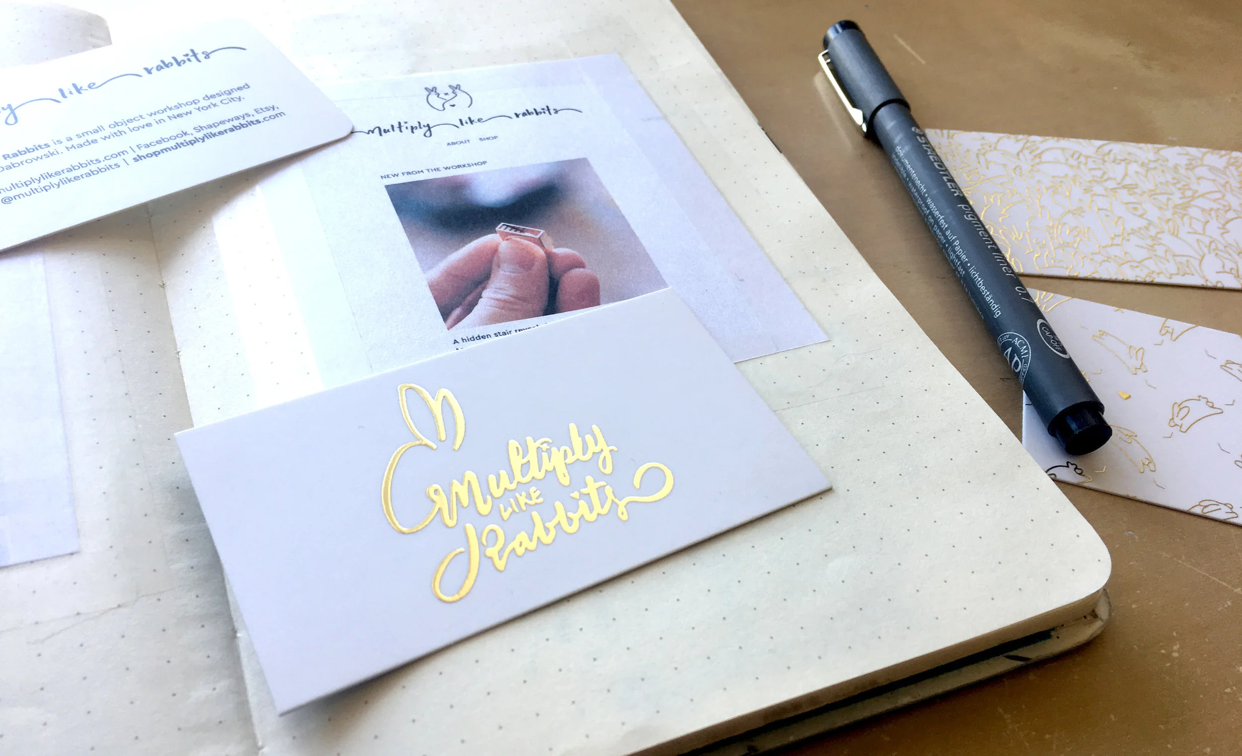
Snapshot of the Multiply like Rabbits website; Rabbit logo by Artur Dabrowski

Snapshot of the Multiply like Rabbits website; Rabbit logo by Artur Dabrowski
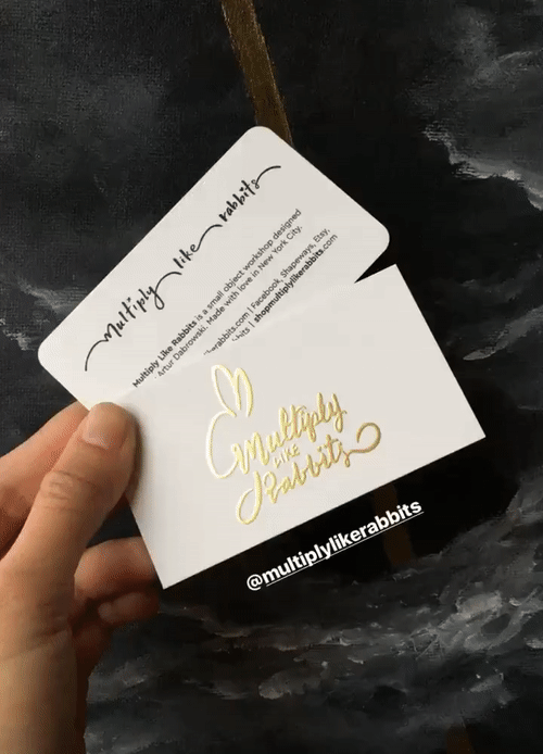
Business Cards
We also developed a second iteration of written logo that both reads as the title and look like a rabbit. Both of these were then used on the brand's business cards.

#throwback
Rabbit adventures in the good ol' architecture school days.
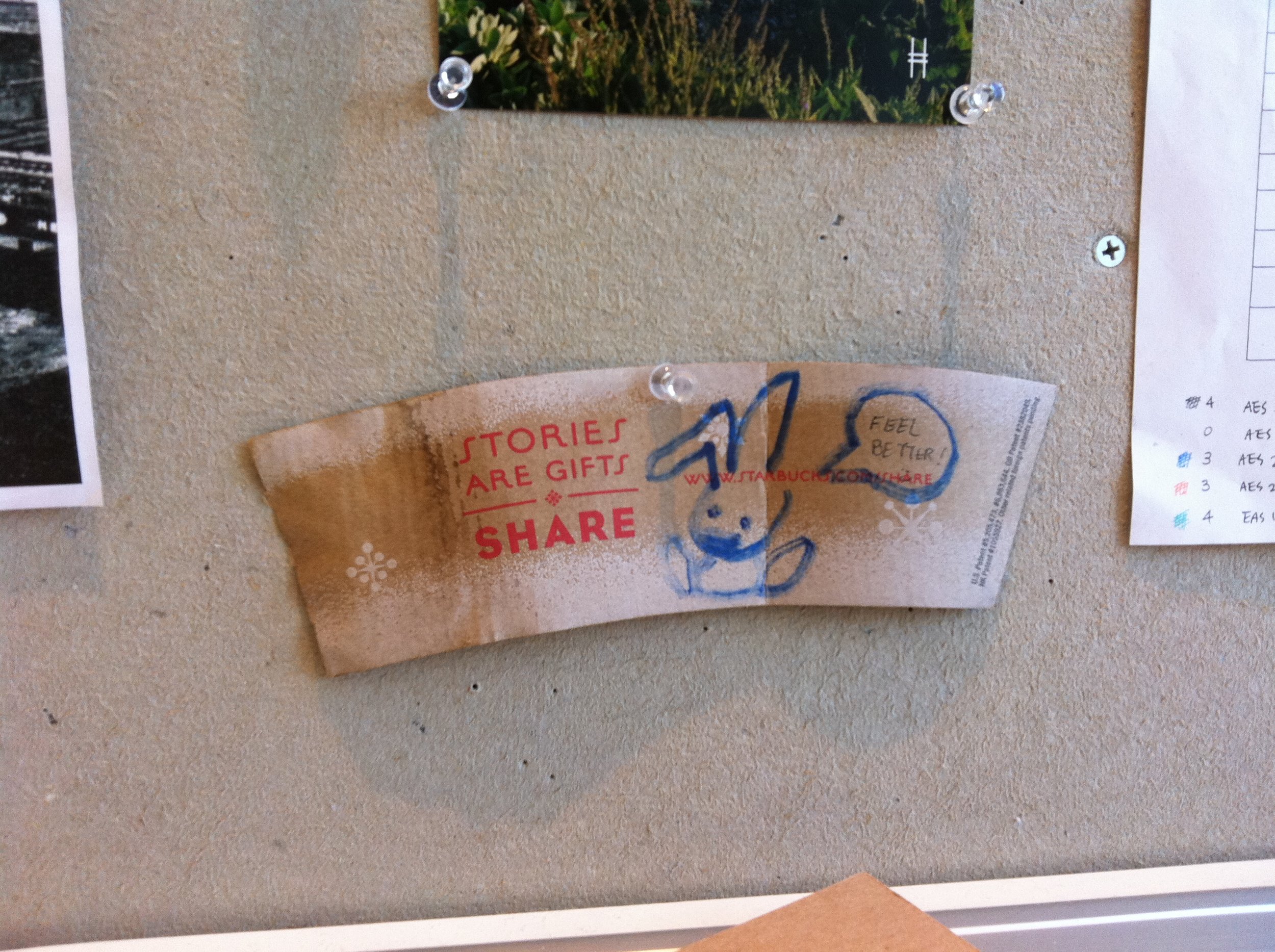
When one inevitably fell ill in the endless chaos that is studio.

When they were put to work to prove their worth.

When they were involuntarily plunged into a murder mystery.
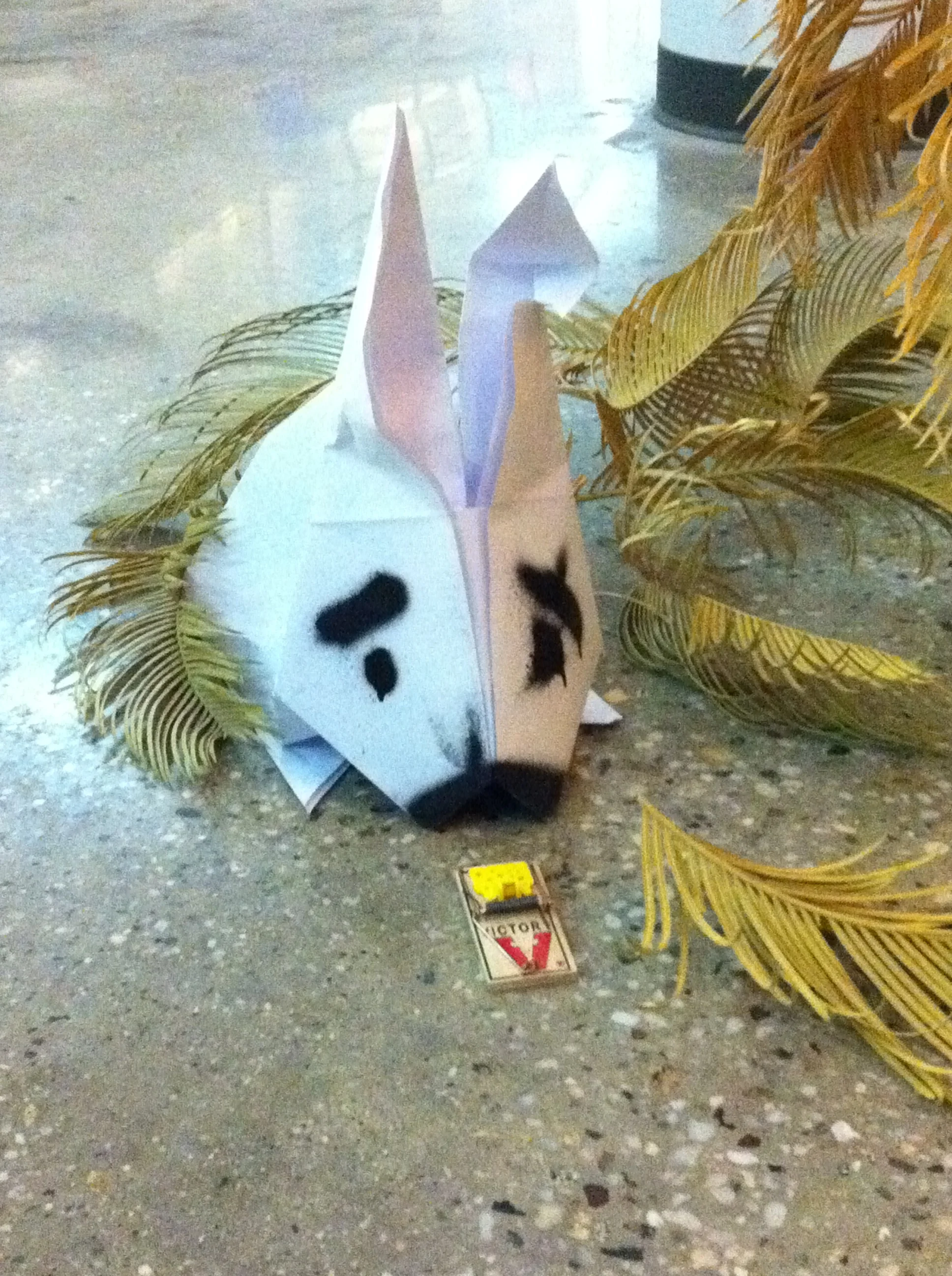
When they encountered rabbit traps in the concrete jungle.